Here are the first SPAC posters hanging around Broadway in Saratoga Springs.
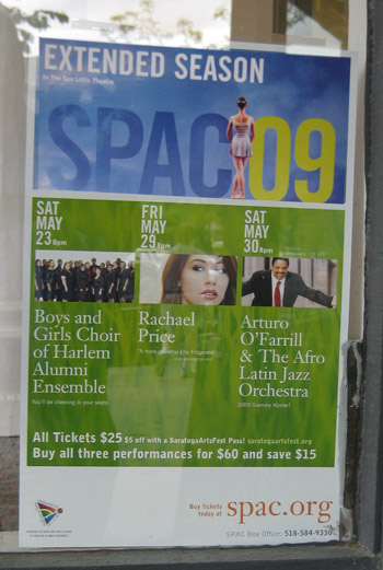
Summer is coming.
Here are the first SPAC posters hanging around Broadway in Saratoga Springs.

Summer is coming.
Posted in The Arts in Saratoga Springs

The Impressions Logo Design
Impressions does a lot of things correctly in the retail business. They have an eclectic offering available for sale, the layout is great, and their branding is really interesting. I don’t think it is great, but they use it really well. The typography is old school from the eighties, but the illustration is kind of unique. As a whole it tells a story about what the store’s philosophy.
There is a rustic theme throughout the store, and it begins with their sign.
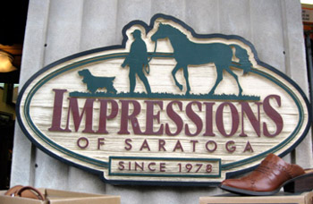
Impressions Store Sign on Broadway Saratoga Springs
They can also be campy and funny.

Impressions Likes Humans Also
I’m not going to rank them, but they have one of the better retail set ups on all of Broadway.
The New Palio Website
I’m trapped, and I can’t get out. Worst of all I know that I’m stuck in a marketing companies website and they seem to be in control. I’ve already answered some questions about myself and I don’t know what they intend to do with it, luckily I lied about everything. But I’m unable to move, I see doorways but I can’t get to them. I also see text on the prison walls, but I can’t read it because it’s to far away. The back button doesn’t work because the site is built entirely in Flash. Please, someone help me.
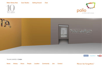
Please Help Me Get Out of Here
There is also classic art trapped with me, in this case the Mona Lisa. She keeps starring at me no matter where I go, very strange. But fear not, I believe these are other people viewing the site, who show up as Avitars that have logged in. Again, I don’t know why or for what purpose. All I came here for was to find out what palio does.
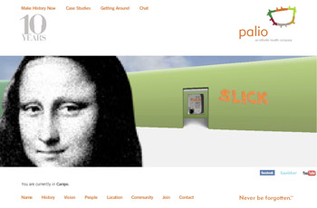
The Mona Lisa is Trapped With Me
Then I notice an instruction sheet on how to navigate the website. STOP.
If you need an instruction sheet on how to navigate a website, you might just stop and ask yourself, is this a good navigation system. I’m still shaking my head at this entire debacle of a site.
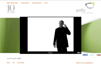
Don't Shoot, it Is Not Worth It!
The Palio website is a total do over, there is very little you can save with this one. Get rid of the 1998 technology and let your clients know you are capable of building modern online communications.
Palio Communications threw away the rule book on building this website. They are the largest and most professional marketing and communications firm in the area, and I am a fan of their work, but they must be held to a higher standard than a local retail store. Did someone read Flash for Dummies and decide to build this site? The rule book of web navigation was written for a reason, and your not cool if you break them all.
How does something like this happen? I believe the point of the site is to explain what Palio actually means, and relate that to the services they provide to their audience. I spent a day coming up with that explanation, because I was in a confused state for twelve hours after my virtual kidnapping and imprisonment.
See for yourself at http://www.palio.com

Brindisi's Restaurant Logo
I have always like the Brindisi’s Restaurant logo. Years ago, I thought “that must be a high end restaurant”. Ambrosino Design may be the designer who created it. I certainly wish they would hire him to update their website and print materials which have no relation to the original design. Over time the whole brand seems to have lost its way with no consistency. With so much competition in the restaurant business on Broadway, I would hate to see their brand become second rate.
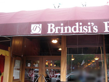
Brindisi's Store Front
And while they are at it, they might want to give the front of the store a freshen up.
The Clothes Line is a new store located in the Collamer Building on Broadway, Saratoga Springs.
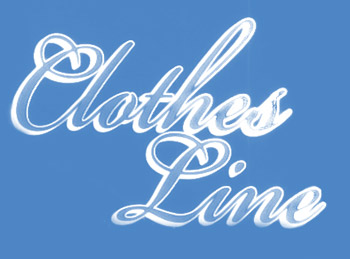
The Clothes Line logo
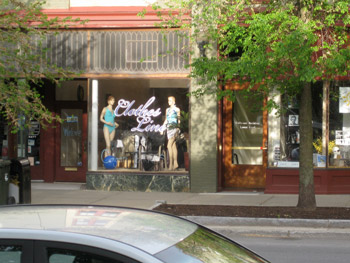
Store Front of the Clothes Line Retail Store

Close up of the Clothes Line Window
I feel the pain of downtown retailers with the exceptionally high rents, so I understand budget branding. Clearly a sign company did the branding, not bad, not good, not memorable.
There is no website for the Clothes Line as of right now.
Posted in Retail in Saratoga Springs
Tagged Branding, clothing store, Retail in Saratoga Springs, Signage
I like locally made posters that are hung in the windows of local retail stores on Broadway in Saratoga Springs. The Actors Guild of Saratoga has a nice – Always Patsy Cline – poster in several venues on Broadway.
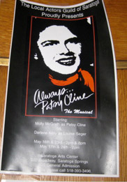
It can be hard to get a good shot without reflections, sorry about the quality.
Posted in The Arts in Saratoga Springs
Professor Moriarty now sits quietly at the bar of Cantina Mexican Restaurant. He is all cleaned up and looking much better than the days before he sold out to Jeff Aimes. The whole new identity is based on a screaming dragon. I tried to find the reasoning behind the the artwork, but my online research into Mexican art was of no help, it is just a cool icon.

Cantina Logo Design
The interior design isn’t much different than Moriarty’s used to be except that it is clean and bright. The warm colors are used sparingly and not in your face. This allows the limited Latin design to fit nicely into the downtown Saratoga ambiance. Their website is well done and sets the tone for what your experience will be. It contains great photography and nice design. This is a testimate that if you have both, you will have a nice site.
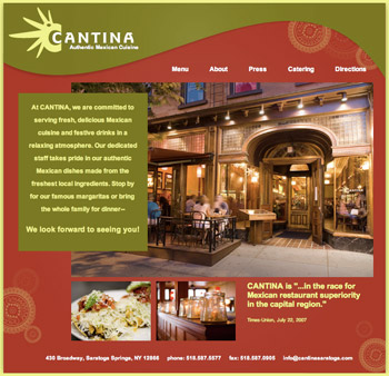
Cantina Restaurant Homepage
I wonder if it was a local firm that did the design work? Good job Cantina.
Max London’s Restaurant on Broadway in Saratoga Springs has been running for about a year now. I finally took some pictures to go along with my article. His design is quite simple and modern. I love the logo, but have no idea who designed it. I don’t even know if it was done locally, probably not.

Sophisticated Max London's Logo
His identity is consistent and well done, this includes the logo, the design of the storefront and the interior – all modern and clean. Overall it was a well thought out job.
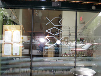
Window to Max London's Restaurant
The designer chose bright colors for the sign, but it doesn’t extend into the other design elements such as the interior.
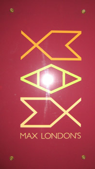
Max London's Sign On Storefront
His website is not well done, and makes the restaurant feel cheap. This has no reflection on the overall identity design, it just implemented badly. Money is always an issue, and maybe the website was less of a priority at the time.

Max London'ts Restaurant Homepage
Mr. London spent time creating a modern urban feel that would cater to a sophisticated NY crowd. They accomplished what they set out to do, but in the future he may want to do away with the cheap paper signs taped to their window stating they now serve brunch.
Posted in Restaurants Saratoga Springs
Tagged Max London's Restaurant, NY, Restaurant logo, Saratoga Springs
I recently saw the new Boyce & Drake logo that is on the side of their truck. The new owners must be Irish or they are going after the Irish plumbing demographic.
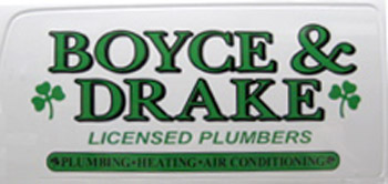
New Boyce & Drake Logo
I don’t know how long this has been out, but it replaces a really old school text logo. If I had to guess, this logo has all the hallmarks of being created by a sign company.

FingerPaint Marketings Not So Great Logo
FingerPaint Marketing is a collaboration between Ed Mitzen and Jaime Butler-Binley. Ed was the founder of Palio Communications, while Jaime was the principal of B-squared Marketing. They initially met at Palio where Jaime worked before starting her own company. This is a brave move for Ed, he has staked his reputation on this company’s success after his stunning accomplishments at Palio. This is a now brainer for Jaime.

The Eight Year Old Founders of Fingerpaint Marketing
FingerPaint is not just a simple little design shop, they have a full staff of 13 creative people, designers and web developers. Maybe they don’t want to give to much away on their client base, but the work they do doesn’t seem to justify their staff – their portfolio on the website is slim with many non corporate clients.
So, what role does this company play in the Saratoga Springs Design scene? I think they are trying to have a real influence in city. They have a section on their website dedicated to giving back to their community. I will only focus on their local clients in this overview.
The first will be the Saratoga Polo Association, which the redesigned the old logo of many decades. Rather than totally eliminate all aspects of the old logo they did a nice job of keeping several aspects while updating it to a more modern version. Excellent job.

Old Saratoga Polo Logo
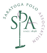
New Version of SPA logo
The brochures and advertising is nice but not earth shaking. I would like to see it have a simple elegance similar to the new logo.

Saratoga Polo Magazine cover
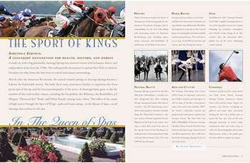
Interior Page Layouts
I would really like to see some beautiful design standards with this job, there are to many typefaces that give it amateur feel overall. The advertising is cleaner but not striking. It is printed in one color and seems to have a look in feel from the 1980’s. It seems that they could start over and build this client a great design evolved around the new logo.
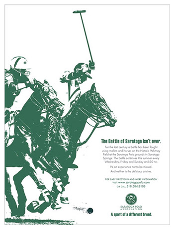
SPA Advertising style
FingerPaint’s strength seems to shine in their copywriting. The web banner ads are consistent and quickly make a point. They are well done.

Saratoga Polo Web Banner
Skidmore College updated the Murray-Aikins Dining Hall, and hired FingerPaint to let students know that great things are to come. The staff did a nice job with their overall design, which included fun illustrations and complimentary text.
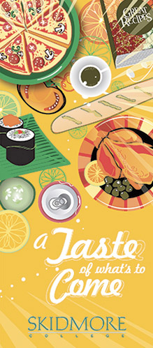
Menu Cover
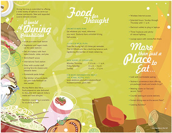
Menu Interior
FingerPaint must be thinking of big things in the future. I don’t know who their audience is, but they are making an effort to be a part of the design community. If you are interested in viewing their website go to http://www.fingerpaintmarketing.com
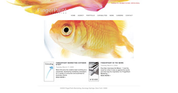
FingerPaint Marketing Homepage