Category Archives: Retail in Saratoga Springs

Victorians Make A Comback

The Adelphi Hotel is one of the few Broadway businesses that recreates traditional Victorian design and makes it work. This is not a popular style these days, and most places either do a dreadful hokey version, or avoid it with modern sleak design. No matter how you feel about it, Saratoga Springs is a Victorian city, and the Adelphi seems to be the sole flag bearer working within the tradition.

From the Moment You Get Our of Your Car It's Perfect

From the Moment You Get Out of Your Car It's Perfect

From a distance, across the street, or right in front of the door, there are no bad views. The small gardens between the sidewalk and the entrance are in harmony with the building design and the surrounding landscaping. The walkway from the street is a grand entrance under a vine covered trellis.

Small Victorian Gardens

Small Victorian Gardens

Whether you love the old world style or not, this is what people come to Saratoga Springs to experience.  They have done a great job with all the details – the type treatment of their logo, the colors of the building, flowers in the pots in front of the doors, even the gold leaf on the entrance door signs, all look as if they have come from Saratoga’s past.
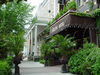
The Grand Entrance

The Grand Entrance

The design consistent even when you look up, with traditional banners, and flowers giving a festive victorian view.
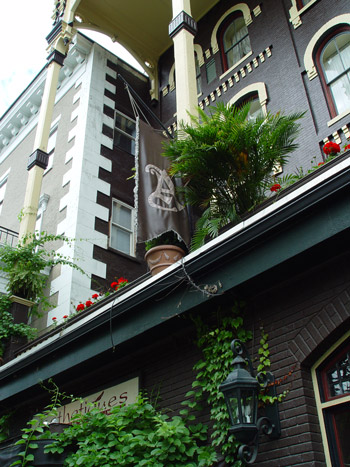
Looking up at the Adelphi Balcony

Looking up at the Adelphi Balcony

The old Saratoga may be fading away, but the Adelphi is letting visitors step back in time and see what originally made this city famous.

Broadway Windows On Fire

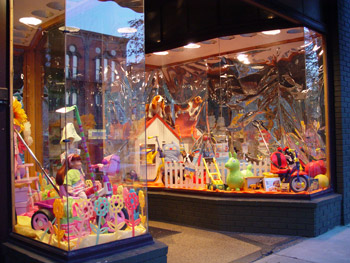
Without a doubt, the best storefront window design is located at G. Willikers toy store. At night they are mesmerizing, and seem as if they are a giant aquarium in a dimly lit room. 

One of G. Willikers Front Windows

One of G. Willikers Front Windows

Taking a Closer Look

Taking a Closer Look

Check Out the Monkey Holding the Book

Check Out the Monkey Holding the Book

One of the reasons this store outshines all others, may be because it is privately owned, and they are not putting up franchised corporate posters. Granted, a toy store has a lot of product to work with, but I have never seen the *Toys R Us* windows look like this.

Secondary Entrance

Secondary Entrance

True, there are a lot of local stores that are half heartedly designed, but all it takes is time. The G. Williker windows are not rocket science, a little tape and reflective paper are a major reason the windows look so incredible, along with a lot of time spent positioning their products in front of it.

I’m not really sure who decorates their windows – whether it is done by a professional, staff or local person would be interesting to know. Could you imagine if all the retail windows had this quality of display? Walking down Broadway at night would be an amazing stroll.

Exchange the Curtain

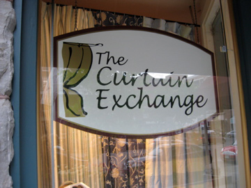
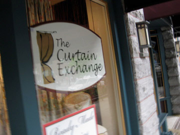
The Curtain Exchange on Broadway in Saratoga Springs is an interesting. I love the fact that we still have specialty stores that do one thing well. Unfortunately they didn’t do a very good job with their logo, but a lot of little things could have been done to make this logo work. The overall look and feel is ok but at least get rid of the big space between the E and Xchange, or tuck the “C” into the cavity in the curtain illustration.

The Curtain Exchange logo and window sign

The Curtain Exchange logo and window sign

But They Are Located In A Great Storefront

But They Are Located In A Great Storefront

They work within the interior design industry!  I would love to see these small stores really take things up a notch.

What do you think?

The Incredible Lightness of Green

Green Conscience

A new store in Adirondack Trust’s Mabee Buildings retail incubator has nice products, and a really bad name.

Green Conscience Home & Garden Logo

Green Conscience Home & Garden Logo

This logo must have been developed by the signage company, unreadable type, meaningless illustration, and not one, but two starbursts. And to top it all off, it always looks crooked for some reason.

Like many stores opened up on a budget, it seems to be missing an overall brand. A lot of parts that don’t really go together. Hopefull the products will drive customers throught the door.

Good First Impressions

The Impressions Logo Design

The Impressions Logo Design

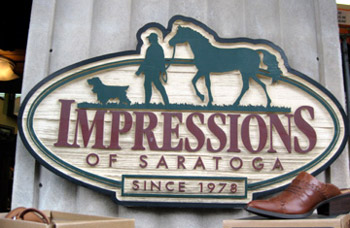
Impressions does a lot of things correctly in the retail business. They have an eclectic offering available for sale, the layout is great, and their branding is really interesting. I don’t think it is great, but they use it really well. The typography is old school from the eighties, but the illustration is kind of unique. As a whole it tells a story about what the store’s philosophy.

There is a rustic theme throughout the store, and it begins with their sign.

Impressions Store Sign on Broadway Saratoga Springs

Impressions Store Sign on Broadway Saratoga Springs

They can also be campy and funny.

Impressions Likes Humans Also

Impressions Likes Humans Also

I’m not going to rank them, but they have one of the better retail set ups on all of Broadway.

Chatting Up the Clothes Line

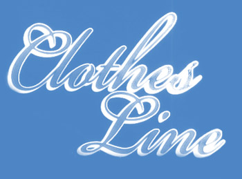
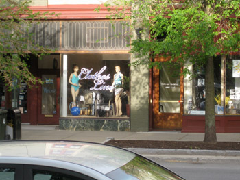
The Clothes Line is a new store located in the Collamer Building on Broadway, Saratoga Springs.

The Clothes Line logo

The Clothes Line logo

Store Front of the Clothes Line Retail Store

Store Front of the Clothes Line Retail Store

Close up of the Clothes Line Window

Close up of the Clothes Line Window

I feel the pain of downtown retailers with the exceptionally high rents, so I understand budget branding. Clearly a sign company did the branding, not bad, not good, not memorable.

There is no website for the Clothes Line as of right now.

Rolling a Stogie on Broadway

Since I’m supposed to be writing about the culture of Saratoga Springs, not just people who create it, I thought I would add another post about a local cigar shop design. This will help make it less of a gossip style update.

When I was a kid no matter what sporting event I attended, the smell of cigars wafted throughout the entire area. This included high school football and the Saratoga Race Track, and I have rather fond memories of that smell. Today there is only one place you get an aroma like that, and it is located at the corner of Broadway and Phila Streets. 

One of the best designed retail stores on Broadway is the cigar shop at that corner. This location has been many things over the years, including a magazine store, gift shop and clothing store, but it was born to be a cigar shop. The door alone says come on in and have a smoke. Recently the name changed but that was all. I don’t know if it is a new owner or a partnership change.

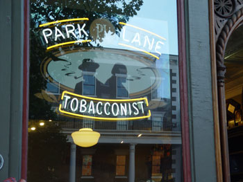
The original Park Lane Tobacco window

The original Park Lane Tobacco window

The original name was Park Lane Tobacconist and the logo was two shifty characters smoking in an oval. It wasn’t great, but it fit well into the overall design. Who ever designed it knows a few rules about how to create logo. Check out the old style lighting fixtures, they are perfect with the overall store design. Even if they came with the building, the interior designer chose to keep them and they deserve credit for that decision. 

Park Lane Logo

Park Lane Logo

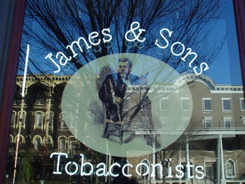
The new company is James and Sons Tobacconists. President Grant must be a client because I’m pretty sure thats him sitting in the chair. 


James & Sons Tobacconists logo

James & Sons Tobacconists logo


The perfect cigar shop

The perfect cigar shop

james-son-window-sign

James & Sons Tobacconists window

The sign in the window is neon lighting similar to the previous one that was there. I think this store is my favorite building on the entire commercial area of Broadway in Saratoga Springs. Congratulations to the owners who created it.

Who’s Who Does What In Saratoga Springs

There are players in Saratoga who play in their own sandbox, and there are players who play in other peoples sandboxes. If this makes no sense to you, just wait a few months and I think it will.

I would like to take some time to look at the creative individuals, organizations and businesses that help define Saratoga Springs culture. This will include Architects, Designers, Sign Makers, etc. Over time this blog will have a small overview of the creative talent that has an effect on this city.

Expecting a Face

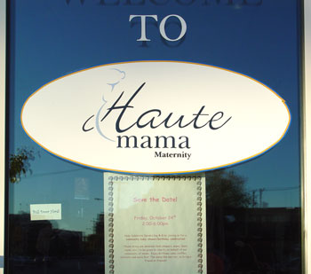
Haute Mama opened about two years ago from a previous adventure in Glens Falls. It is located in the Adirondack Trust Mabee Building.  Their design seemed to be an update from their previous business called Great Expectations. The problems is they made some difficult changes their identity. The old logo was easy to read and say. The new name, Haute Mama, is kind of difficult to enunciate, let alone define. 


Old Logo Design

Old Logo Design


Most of all it is just plain hard to read. What is that thing coming out of the pregnant womans stomach? Why didn’t the designer just cut that part of the H off?  

Haute Mama

Haute Mama Logo

Now my rant is over. A lot of small stores do not hire designers to do their work because it is expensive. If I had to guess, she made the logo updates on her own computer. I respect that. The actual illustration is a carry over from the previous company, and I liked how it was used at that time. Now it is lost in the text. 

So I don’t love the new logo, but the signage on the store window really should be changed. It looks like the black and white No-Name brands back in the eighties. Even worse it is the best signage in that entire building. 


Haute Mama Window Sign

Haute Mama Window Sign

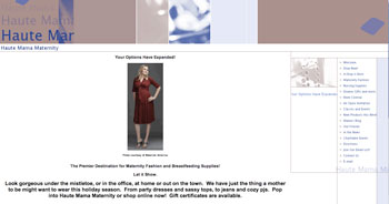
I looked for a Website and believe this is it, although it has completely different branding elements. 


Haute Mama web Page

Haute Mama web Page

This may just be a beginning for her, and the store will grow over the next five years. I believe that the Mabee building is a retail incubator, which means stores can only stay for a fixed amount of time before moving to a better location. I think the pressure will be on for a better looking window sticker at that time.

If nothing else, please give the woman in the logo a face.

I Need A Face

I Need A Face